Mastering Color Combinations: From Posters to Palettes
Hey everyone! Ever feel like your designs are missing that zing? Often, the secret lies in the power of color. Choosing the right colors can make all the difference, whether you’re designing a poster that pops or crafting a brand identity that resonates. In this post, we’ll dive deep into the world of color combinations, exploring everything from fundamental principles to practical applications, focusing specifically on finding the best color combinations for various projects, including nailing the perfect color combination for poster design.
Why Color Combinations Matter (and Why They’re Crucial for Posters)
Think about it: a website with clashing colors is jarring, a painting with muddy hues is unappealing, and a poster with a poor color combination fails to grab attention. Color is a powerful tool for communication, and understanding how to combine colors effectively is crucial for any designer, artist, or even someone just trying to spruce up their living room. For posters, the best color combinations are essential for attracting attention from a distance and conveying your message quickly and effectively.
The Color Wheel: Your Best Friend (Especially for Finding the Best Color Combinations)
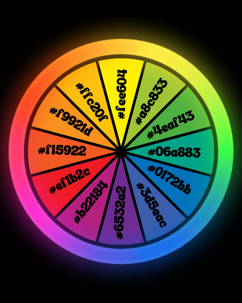
Before we jump into specific combinations, let’s talk about the color wheel. This handy tool organizes colors based on their relationships. Understanding the color wheel is the foundation of creating harmonious and visually appealing designs, and it’s your key to unlocking the best color combinations. You’ll find primary, secondary, and tertiary colors, as well as concepts like hue, saturation, and value. Familiarize yourself with it – you won’t regret it!
Basic Color Schemes: Building Blocks of Design (and Poster Power)
Let’s explore some fundamental color schemes, all of which can be used to create the best color combinations, even for something as specific as a color combination for poster design:
Monochromatic
This scheme uses different shades and tints of a single color. It’s simple, elegant, and creates a sense of unity. Think of a website with varying shades of blue, from light sky blue to deep navy. For a poster, this can be incredibly effective for a clean, sophisticated look.
Analogous
Analogous colors sit next to each other on the color wheel. They create a harmonious and calming effect. Imagine a landscape painting with greens, yellows, and oranges, mimicking the colors of a sunset. A color combination for poster using analogous colors could evoke a sense of peace or tranquility.
Complementary
These colors are opposite each other on the color wheel. They create high contrast and vibrancy. Think of the classic red and green combination often used in Christmas decorations (though be careful not to overuse it!). For a poster, a complementary color combination can be incredibly eye-catching.
Triadic
Triadic schemes use three colors evenly spaced on the color wheel. They offer a balanced and vibrant look. Consider a design using blue, yellow, and red – a classic triadic combination. This is a great option for a poster that needs to be dynamic and attention-grabbing.
Tetradic
This scheme uses four colors in two complementary pairs. It can be complex but offers a rich and dynamic feel. Imagine a design using blue, orange, yellow, and purple. This can be a powerful color combination for poster design, but it requires careful balancing.
Beyond the Basics: Exploring More Complex Combinations (for Even Better Posters)
Once you’re comfortable with the basics, you can start experimenting with more complex combinations. Don’t be afraid to mix and match different schemes to create your unique style. This is especially important when searching for the best color combinations for a specific project like a poster.
Real-World Applications: Where Color Combinations Shine (Posters Included!)
Let’s look at how color combinations are used in various fields:
- Web Design
- Graphic Design
- Interior Design
- Fashion
- Photography
- Poster Design: Finding the best color combination for poster design is crucial for grabbing attention, conveying information quickly, and creating a memorable visual impact.
Tips for Choosing the Right Color Combinations (Especially for Posters!)
- Consider your audience: Who are you designing for? Different colors evoke different emotions in different cultures. This is especially important for poster design, where you need to connect with your target audience quickly.
- Think about the message: What do you want to communicate? Certain colors are associated with specific feelings and ideas. For a poster, your color combination should reinforce your message.
- Use a color palette generator: Tools like Adobe Color or Coolors can help you create harmonious color schemes.
- Experiment and play: Don’t be afraid to try different combinations and see what works best. This is crucial for finding the best color combinations.
- Look for inspiration: Pay attention to color combinations in nature, magazines, and other designs. Look at successful poster designs for inspiration.
9 Effective Color Combination Examples (and How to Use Them, Including for Posters!)
Let’s explore nine different color combinations and how you can use them, with a focus on their potential for color combination for poster design:
- Navy Blue & Gold: A classic and sophisticated combination, perfect for corporate branding or elegant designs. For a poster, this could convey luxury and prestige.
- Teal & Coral: A refreshing and vibrant combination, ideal for summer-themed designs or projects targeting a younger audience. A poster using this color combination would feel energetic and fun.
- Gray & Yellow: A modern and versatile combination, suitable for minimalist designs or projects that need a touch of brightness. This color combination could create a clean and professional poster.
- Black & White: A timeless and classic combination, perfect for high-contrast designs or projects that need a clean and simple look. This is always a strong choice for a bold and impactful poster.
- Red & Orange: A bold and energetic combination, ideal for projects that need to grab attention. Use with caution, as it can be overwhelming. A poster using this color combination would definitely stand out.
- Green & Brown: A natural and earthy combination, perfect for eco-friendly brands or projects that need a calming feel. This color combination could be perfect for a poster promoting an environmental cause.
- Purple & Pink: A playful and feminine combination, suitable for projects targeting a female audience or designs that need a touch of whimsy. This color combination could be great for a poster for a children’s event.
- Blue & White: A clean and calming combination, often used in healthcare or technology-related designs. This color combination might be suitable for a poster for a medical conference.
- Orange & White: A friendly and approachable combination, often used in food or hospitality industries. This color combination could be perfect for a poster advertising a restaurant.
The Psychology of Color: Understanding the Impact (Especially on Poster Viewers)
Colors have a powerful psychological impact. Understanding these associations can help you choose the best color combinations, especially for posters where you need to evoke a specific response quickly. Think about it: a poster for a children’s hospital shouldn’t use the same colors as a poster for a heavy metal concert!
- Red: Passion, energy, excitement, but also anger and danger.
- Blue: Trust, calmness, stability, but also sadness and coldness.
- Yellow: Happiness, optimism, creativity, but also caution and cowardice.
- Green: Nature, growth, harmony, but also envy and greed.
- Orange: Enthusiasm, energy, warmth, but also cheapness and superficiality.
- Purple: Royalty, luxury, wisdom, but also mystery and mourning.
- Pink: Love, compassion, femininity, but also weakness and naivety.
- Black: Power, elegance, sophistication, but also death and mourning.
- White: Purity, innocence, cleanliness, but also coldness and sterility.
When designing a poster, consider the psychological impact of the colors you choose and how they align with your message and target audience. The best color combinations will not only look good but also effectively communicate your intended message.
Tools and Resources for Color Inspiration (and Poster Design)
Finding the best color combinations for your poster can be made easier with the right tools:
When using these tools, always keep your poster’s purpose and target audience in mind. The best color combinations for a poster will depend on its specific context.
Final Thoughts: Embrace the Power of Color (and Make Amazing Posters!)
Remember, color is a powerful tool. By understanding color theory, using the right resources, and developing your own sense of style, you can harness the power of color to create stunning and impactful designs, including posters that truly shine. Finding the best color combinations is essential for creating posters that grab attention, communicate effectively, and leave a lasting impression. So go forth, experiment, and let your creativity shine! Find those best color combinations and create posters that wow!
Jumpstart your projects with our design templates:
- Social Media Posts: Create engaging content with our Post Templates.
- Ads: Design high-converting ads using our Ad Templates.
- Wedding Invites: Craft beautiful invitations with our Wedding Invite Templates.
- Product Designs: Showcase your products with our professional Product Templates.
- Logo Designs: Build a strong brand identity with our Logo Templates.